
Balancing return and stability over the recent market crushes
Ranking of 200+ ETFs that held up better than the world market over the last three crashes

In the previous post I studied which ETFs held up during sharp market declines. I wanted to capture the most recent trends and picked a short period (a bit more than a year), which gave me only 3 significant crashes.
To compensate for the small number of events, I searched only for the assets that demonstrated near-cash stability. So I got an answer to the question: “Which assets have been defensible enough since June 2024?“.
Today I will try to answer another question:
Which assets in the recent past were more resilient than the market and yielded respectable returns over the 1-year period?
Study design & dataset
I used the same dataset. But this time I didn’t just filter the list of ETFs — I ranked them by performance across all four tests (three crashes + one-year return).
Here’s how the ranking works:
Crash ratio: for each crash, compare the asset’s return with the benchmark’s return.
Hard rule: if there isn’t at least a slight outperformance in all three crashes, the asset is screened out.
Score: for the survivors, combine the three crash ratios and the one-year return into a single score.
The logic behind it is super simple:
Each crash is a stress test — did the asset hold up better than the market?
The one-year period is the payoff simulation — how much the asset rewards for holding it?
Note that we can create an infinite number of different rankings with a similar methodology. All we need to do is to change the weights of different factors.
The results I discuss in this post are designed to ensure that during each event the asset must perform notably better than the market, just to be in the ranking. But the most weight in this ranking is pulled by 1-year return. All the math logic you can find in this SlideShare presentation. You may also be interested in the Python code; using Google Colab it is easy to change weights and create your own ranking.
Findings
Here is the file with the ranking:
Of course, I am not interested in the ranking per se. It is not a way to find the best ETF and blindly buy it. The purpose of this file is to find strategies that are worth considering, not particular assets.
The fact that the top of the ranking occupies the hyper-risky Leverage Shares -3X Short Coinbase Coin ETP USD alone should remind you that any ranking is only a crude reflection of reality. To make this crude reflection useful we always need to remember what it reflects and what doesn’t.
So the next step is to classify each eligible ETF by underlying asset and strategy. Here’s the classification (done by AI; then I manually did a sanity check and fixed a couple of mistakes):
As you can see, among 214 ETFs and ETPs, there are:
Precious metals.
Specific sectors (gold miners, infrastructure, utilities).
Specific sectors + specific geo (telecommunications in the EU, climate in emerging markets).
Country ETFs (China).
Dividend income.
Low-volatility equities.
Bonds.
There are also examples of more exotic themes, like sustainable food, but I counted only strategies that occurred at least a few times.
Three observations
1. Equities and commodities dominate the ranking
Earlier I warned about blind use of rankings. On the other hand, we should not just ignore it. We just need to see the bigger picture.
More than half of the list is bond-related products. However, the top 50 is dominated by commodities and equities. It makes sense: bonds are usually more stable, but in a bull cycle equities outperform.
2. China ETFs shine — but after years of underperformance
I was a bit surprised to see 5 China ETFs in the top 15. Out of pure curiosity, I can someday explore why, but from a practical point, I do not think China ETFs can play a role of a moderately defensive asset.
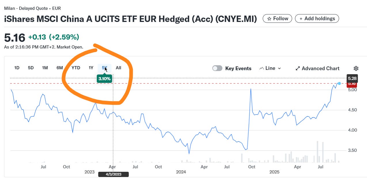
A 3% return over 5 years is definitely not my dream. Not to mention that concentration risk associated with a single country defeats the very idea of a defensive strategy.
3. Equity strategies are significantly overlapping
The ranking includes sector (telecom, utilities), high dividend equity, and low volatility ETFs. A first instinct might be to combine them for diversification. But these different ETFs often hold similar stocks.
Here’s the breakdown of sectors for one of the dividend ETFs:
Financials 28.20%
Utilities 16.48%
Industrials 12.66%
Energy 11.58%
Telecommunication 8.52%
And here’s the same for one of the low volatility ETFs:
Financials 19.96%
Consumer Staples 19.62%
Utilities 15.34%
Industrials 13.12%
Telecommunication 11.77%
There is a difference, of course. But the similarity is obvious. Moreover, note that utilities and telecom are also here.
Conclusions
I think the best fit for my purpose (some defense, without sacrificing growth entirely) is one of three approaches:
precious metals or mines equity (very tempting, but how long the gold rally will continue is questionable);
low-volatility equity (actually, these ETFs are specifically designed for my goal);
dividend income equity ETFs (most of them distribute, but I go only accumulating; in my account it’s less tax drag, your mileage may vary).
I think I will end up picking 1+2 or 1+3. To choose, I am going to do a bit more research on low volatility vs. dividend income.
This publication is for informational and educational purposes only. It is not investment advice, tax advice, or a recommendation to buy or sell any security. I am not a licensed financial advisor. Investing involves risks, including the possible loss of capital. Always do your own research or consult a professional before making financial decisions.